Adapting to a corporate rebrand often involves a transition period, especially when your beloved snack or trusted paper towel brand undergoes a sudden name change or drastic packaging transformation.
While some rebrands breathe new life into brands, others end up leaving consumers feeling perplexed and dissatisfied. Here’s a list of the most disappointing company rebrands in history.
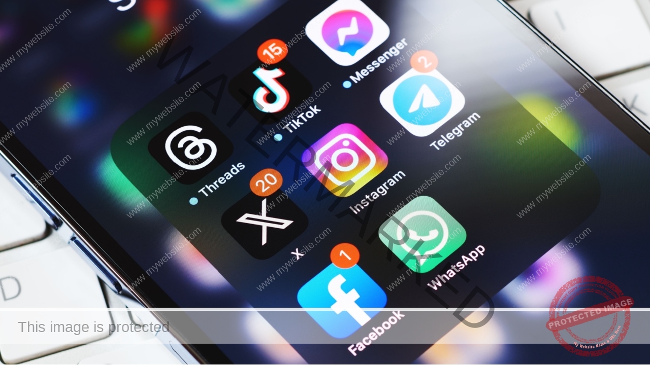
1. Twitter Becoming X
This is an obvious one that has received a lot of attention in the last couple of years. Instead of the adorable and innocent little blue Twitter birdie, we now have the aggressive X logo. I miss the little birdie, and I miss posts being called “tweets,” Can we go back in time, please?
2. HBO Becoming Max

Actually, HBO made HBO Go and then changed it to HBO Max, and then changed it again to just Max. HBO probably feels the need to stand out among all the streaming services, but the constant rebrands can get confusing.
3. The New Pringles Guy

The old Pringles Guy has a bowtie, hair, and a detailed mustache. The new one feels more modern and less friendly somehow. This rebrand may not have been awful, but it was unnecessary.
4. Angie’s List Becoming Angi

Every Angi commercial clarifies that they used to be Angie’s List. They rebranded years ago, but it seems like the new name hasn’t caught on despite its simplicity. Like others on this list, the goal seems to be to appear more modern, but maybe Angi didn’t quite pull it off.
5. ABC Family Becoming Freeform
People loved ABC Family, and nothing really changed when they rebranded to Freeform. While they might have wanted to get away from their association with “family” programming, Freeform feels like it lacks an identity.
6. Comcast Becoming Xfinity

Technically, Comcast still exists, but they rebranded their internet and TV services to Xfinity, likely because people were growing tired of Comcast and looking for alternatives. Xfinity even used to bash Comcast in commercials as though it was a competitor and not the same service.
7. The Sci-Fi Channel Becoming SyFy
This channel might have rebranded to seem more approachable to people who weren’t necessarily passionate about science fiction shows and movies. I don’t mind SyFy, but I doubt it lured a bunch of new viewers.
8. Gap Becoming The Gap

Gap spent millions of dollars to add “The” to their brand name and switch to a sans-serif font. I don’t think anyone even noticed the rebrand because it was so slight, and they eventually abandoned the idea and reverted back to what they had, which was essentially the same anyway.
9. Pizza Hut Becoming The Hut

Pizza Hut might be a questionable name to begin with (who wants to buy food from a hut?), but the name and logo are iconic. Rebranding to “The Hut” definitely did not resonate with customers.
10. Sierra Mist Becoming Starry

Sierra Mist has always struggled in the shadow of Sprite, so they tried to rebrand as Starry. The idea was people would be enticed to try this new beverage, but that didn’t happen. If anything, Starry is less known and less popular compared to Sierra Mist.
11. Facebook Becoming Meta
Like Twitter, Facebook rebranded to a vague name that sounds cool but doesn’t really mean anything. Even when you read news about Meta, they still refer to it as “formerly Facebook” because no one is comfortable calling it Meta. The name Facebook was iconic, and changing it was a mistake.
12. Netflix’s Attempt at Qwikster

This rebrand was a complete failure and lasted about three weeks. Back in the old days, when Netflix sent out DVDs, they tried to rebrand the DVD service as separate from the streaming service, calling it Qwikster. Customers were fervently against it, so they abandoned the idea less than a month after launching it.
13. Land Rover Becoming JLR

For some unknown reason, Land Rover ditched their name and decided to only refer to themselves as JLR, short for Jaguar/Land Rover. I’m guessing they just wanted to include Jaguar in their brand name, but it’s confused many consumers and hasn’t made a positive impact.
14. Dunkin’ Donuts Becoming Dunkin’

This rebrand doesn’t seem significant, but loyal customers of the New England coffee brand found it jarring. Dunkin’ Donuts changed its name to Dunkin’ a few years ago, probably because it was colloquially known as “Dunkin'” already. They also got rid of their classic coffee cup logo!
15. Weight Watchers to WW

The Weight Watchers rebrand has been pretty unsuccessful, as people still call the company Weight Watchers. They likely changed the name to avoid offending anyone or creating a stigma around the company, but the rebrand to WW has been mostly ignored.
16. Kellogg’s Becoming Kellanova

Kellogg’s is a company with a rich American history, as Dr. Kellogg basically invented cereal, creating a booming industry. They’re rebranding parts of their company to Kellanova, as they want to separate certain sectors of the business so they can operate differently.
17. Tropicana Losing the Red Striped Straw

If you don’t drink orange juice, you probably don’t even know this happened. Tropicana’s logo used to be an orange with a striped red and white straw stuck in it. They ditched this image to create a more minimalist and modern package design, which, funny enough, enraged some of their customers.
18. McDonald’s Losing Its Color
McDonald’s didn’t change its name like most of the rebrands on this list, but it went from being a colorful, playful place where kids felt at home to a gray, modern restaurant chain. They probably wanted to seem more mature, but they ruined the pleasant nostalgia for many people.
19. PWC Consulting Becoming Monday

Monday is a cloud-based work platform where people can communicate and plan. While PWC Consulting wasn’t exactly catchy, the name Monday can make certain conversations confusing and inefficient. Are you referring to the system or the day of the week?
20. Kia’s New Logo
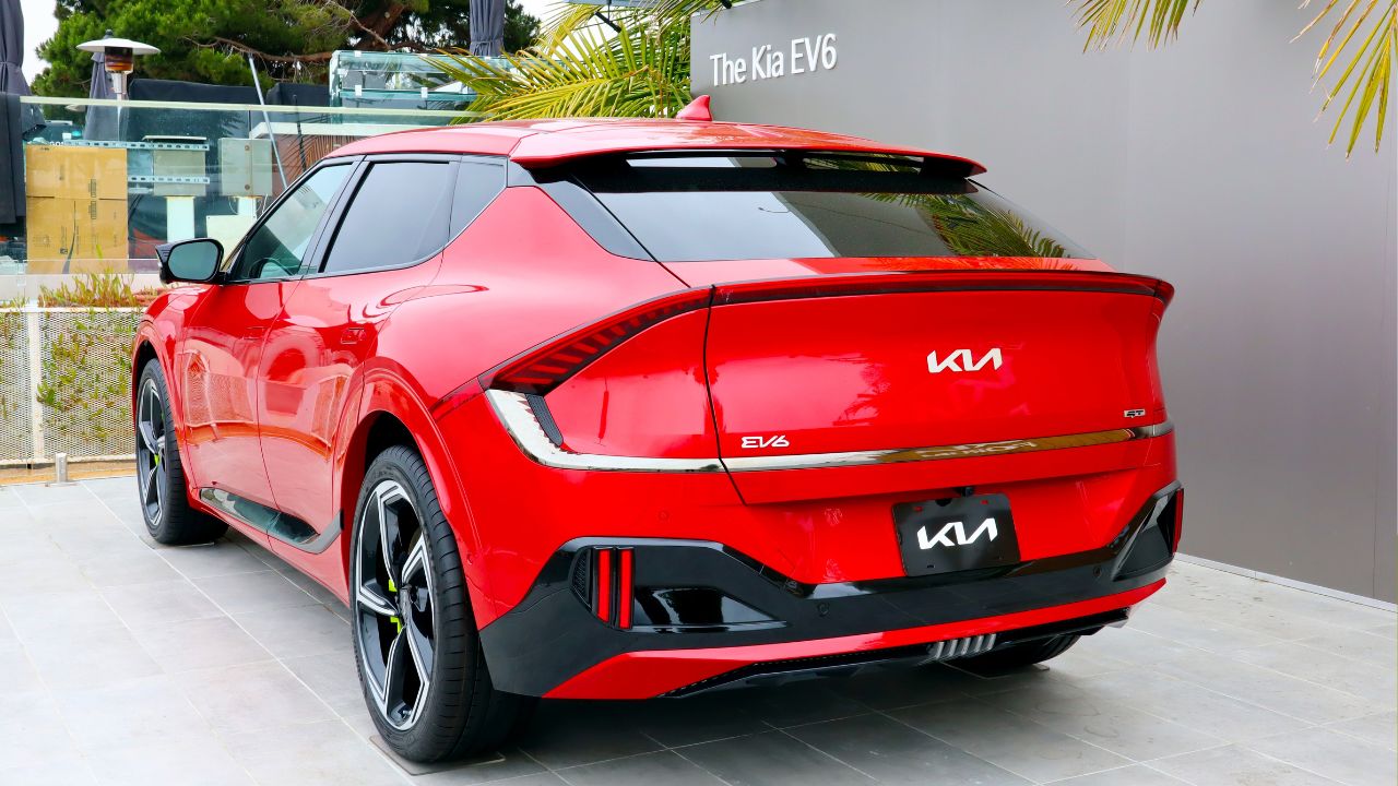
Kia recently redid its logo, squishing the three letters closer together and opting for a more minimalist design. However, they may have made it too minimalist. It is hard to recognize the brand now, and many Nine Inch Nails fans have pointed out that it is extremely close to the NIN logo the band uses.
21. Take 5’s New Packaging

Take 5 used to be a delicious candy bar that was outside the mainstream, with a bold black wrapper and green lettering. Now, it looks like all the other Reese’s products and is hard to distinguish. Those who always chose Take 5s in the candy aisle have been disappointed by the new look.
22. Datsun to Nissan
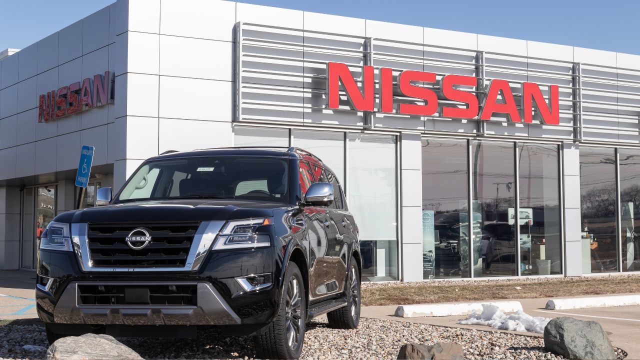
Up until the ‘80s, Nissan was known as Datsun. The company made this change to make Nissan a stronger brand and leave behind the older models. This rebrand isn’t the worst, but some consumers were perplexed, as Datsun was a reputable and trusted name in the car industry.
23. IHOP to IHOb

This rebrand was only temporary, but it was still weird and unforgettable. IHOP changed its name to IHOb to let people know they now sold burgers in addition to their famous pancakes. People thought the change was silly, and some folks thought that pancakes were leaving the menu.
24. Mr. Pibb Becoming Pibb Xtra

People disliked this rebrand for a few reasons. First, Mr. Pibb was a well-known and charming name, while Pibb Xtra feels a little obnoxious. Additionally, the new flavor profile was a big disappointment to many consumers, as they adored the original flavor and didn’t appreciate the extra spice.